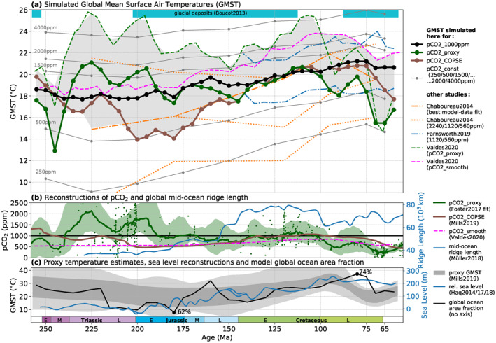
Figure 1.

Simulated Mesozoic long‐term global mean temperature evolution (a) for different pCO2 pathways (b), compared with other relevant proxy and model data (a–c). (a) Each dot represents one simulated equilibrium climate state. Solid lines connect states belonging to the same pCO2 pathway. Green and brown dots correspond to the pathways using the proxy‐ and model‐based reconstructions pCO 2_proxy (Foster et al., 2017) and pCO 2_COPSE (Mills et al., 2019) indicated in the same colors in (b). Black and gray dots and lines correspond to the pathways with constant pCO2 of 1,000 ppm (black) or 250–4,000 ppm (gray). The gray‐shaded area indicates the envelope of temperatures simulated here (for pCO 2_proxy and pCO 2_COPSE) and in other climate modeling studies (broken lines, Chaboureau et al., 2014; Valdes et al., 2020). Also shown are results from Farnsworth, Lunt, O'Brien, et al. (2019). Cyan‐colored bars indicate the occurrence of glacial deposits (Boucot et al., 2013; Cao et al., 2018). (b) pCO 2_proxy (green) and pCO 2_COPSE (brown) reconstructions. For pCO 2_proxy, small dots indicate the raw data points while the line and the shading indicate the LOESS fit provided by Foster et al. (2017) and its 95% confidence intervals. The dashed pink line is the pCO 2_smooth reconstruction used by Valdes et al. (2020), which yields the pink dashed temperature curve in (a). Mid‐ocean ridge length reconstruction (blue line, Müller & Dutkiewicz, 2018). (c) The gray shading shows GMST envelope from Mills et al. (2019) (Figure 4b) which was obtained from δ18O, TEX86, and Mg/Ca low‐latitude sea‐water temperature data through scaling relations (see supporting information section 6 for further discussion). The black line indicates the global ocean area fraction exhibited by the paleogeographies implemented in the simulations based on Scotese and Wright (2018). The blue line represents the long term sea‐level reconstruction from Haq (2014) and Haq (2017, 2018).
