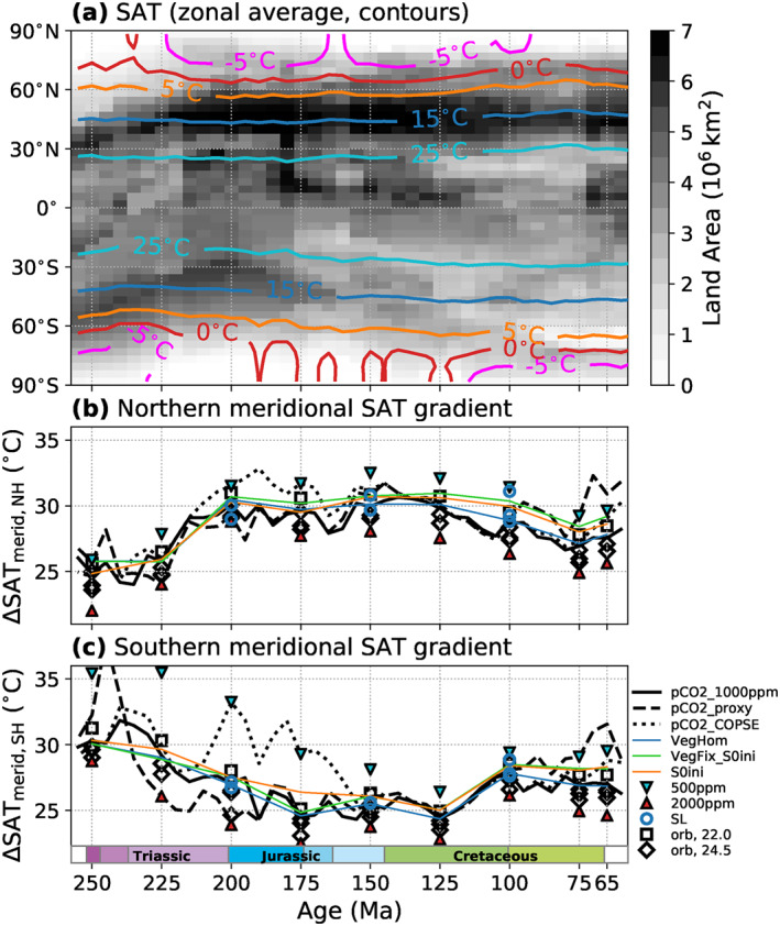
Figure 5.

Evolution of simulated zonal mean surface air temperatures (SAT) (a), and the thermal contrast between low‐latitude and northern (b) and southern (c) high‐latitude regions. (a) Contours indicate annual zonal mean SAT for all runs of the P pCO2_1000ppm pathway, resolved by latitude and geologic time. For this, zonal mean SAT data from all 5 Myr timeslices were aggregated with each timeslice represented by one grid column. The contour colors correspond to those in Figure 4. The gray shading indicates the changing latitudinal distribution of land area in the model paleogeographies. (b and c) Annual zonal mean SAT difference between low‐latitude (<30° lat.) a northern (b) and southern (c) high‐latitude regions (>60° lat.) through time for the different tested boundary conditions.
