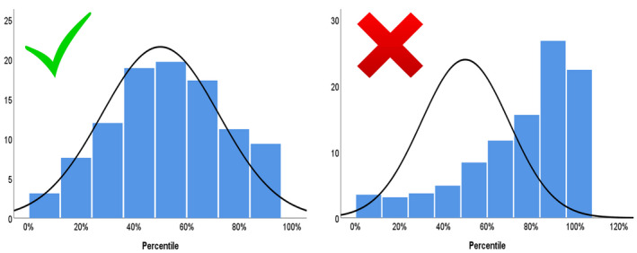
FIGURE 3.

Illustration of the statistical validation of two charts in a local population. The left chart shows a good match to the population of interest: the distribution of fetal weight percentiles based on this chart follows a normal distribution that is centered at the 50th percentile, with approximately 10% of the population below the 10th and above the 90th percentile. The right chart shows a poor fit for the population of interest as it is skewed to the right: it overdiagnoses fetuses as large for gestational age and underdiagnoses small‐for‐gestational‐age fetuses. [Colour figure can be viewed at wileyonlinelibrary.com]
