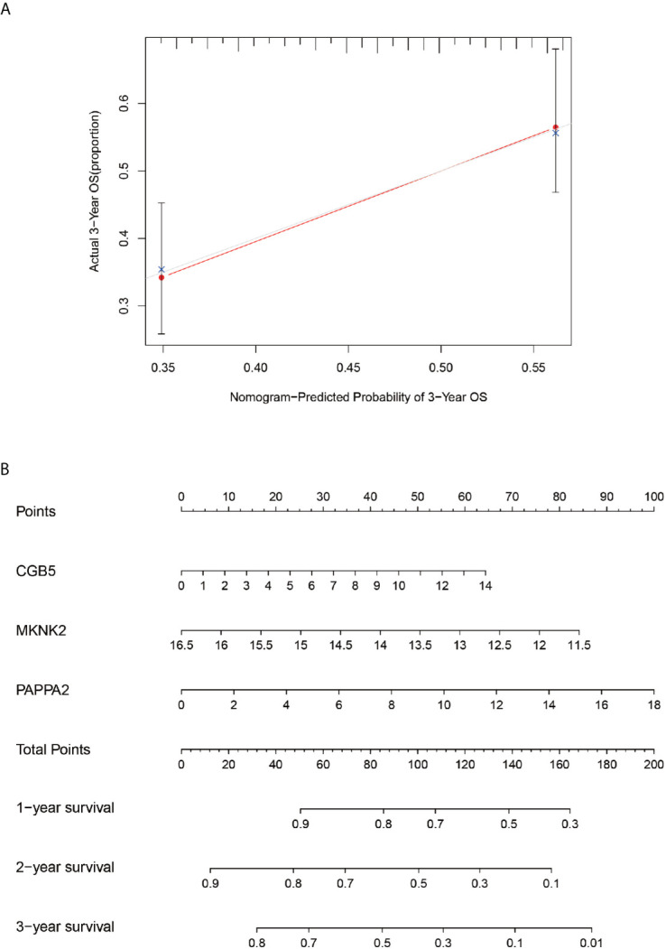
Figure 10.

Calibration and column line diagrams. Chart (A), the red line segment indicates actual survival and the gray line segment indicates predicted survival, which almost overlap. The (B)-plot represents a column line plot constructed based on three genes and 3-year scores for predicting survival.
