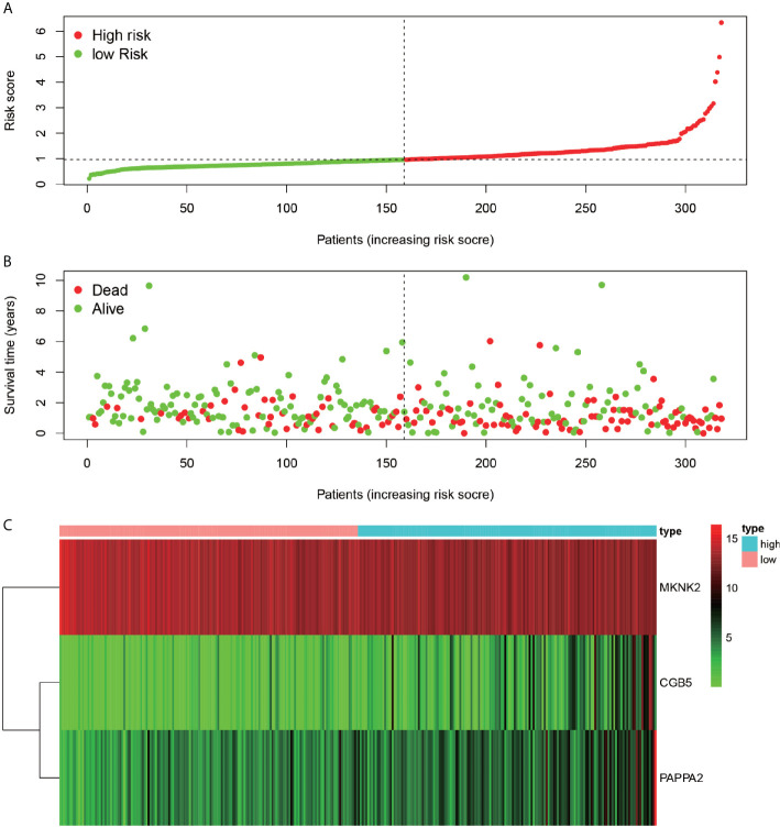
Figure 9.
Riskiness assessment. Chart (A) represents the ranking of all patients in order from low risk to high-risk line based on the level of risk. Chart (B) indicates the survival of individual patients, with red dots indicating death and green dots indicating survival. (C)-plots indicate the gene expression of the three genes used to construct the model in each sample.

