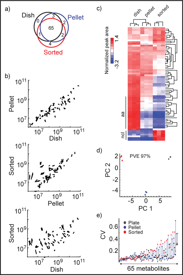
Figure 2.
Peak area data from the validation experiment. a) Venn diagram of good quality peaks detected in dish, pellet, and sorted extracts, b) Scatter plots of peak areas between dish, pellet and sorted extracts. All replicates are shown and connected by lines, c) Heat map of normalized peak areas, clustered by metabolites and samples. ncl: nucleotides, aa: amino acids. d) Principal component analysis (PCA) of normalized peak areas. PVE: percentage of variance explained. Red: sorted, blue: pellet, black: dish extracted cells. e) CV (Coefficient of Variation) of peak areas of 65 metabolites from plate, pellet and sorted extracts. Metabolites are plotted in increasing order of mean CV of the extracts.

