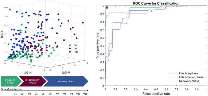
Figure 4.
Distribution of antibody results. (A) 3D scatterplots representing the relation between IgG-N, IgG-S and IgM antibodies detected in three phases of the disease: Infection phase, inflammation phase and recovery phase. Values are expressed in antibody level/cutoff. (B) ROC curves for the classification tree model: Applied on the infection phase, inflammation phase and recovery phase data. The x-axis represents the fraction of negative examples classified as positives. The y-axis shows the fraction of positive examples classified as positives. The probabilities for class prediction were estimated by leave-one-out cross validations.

