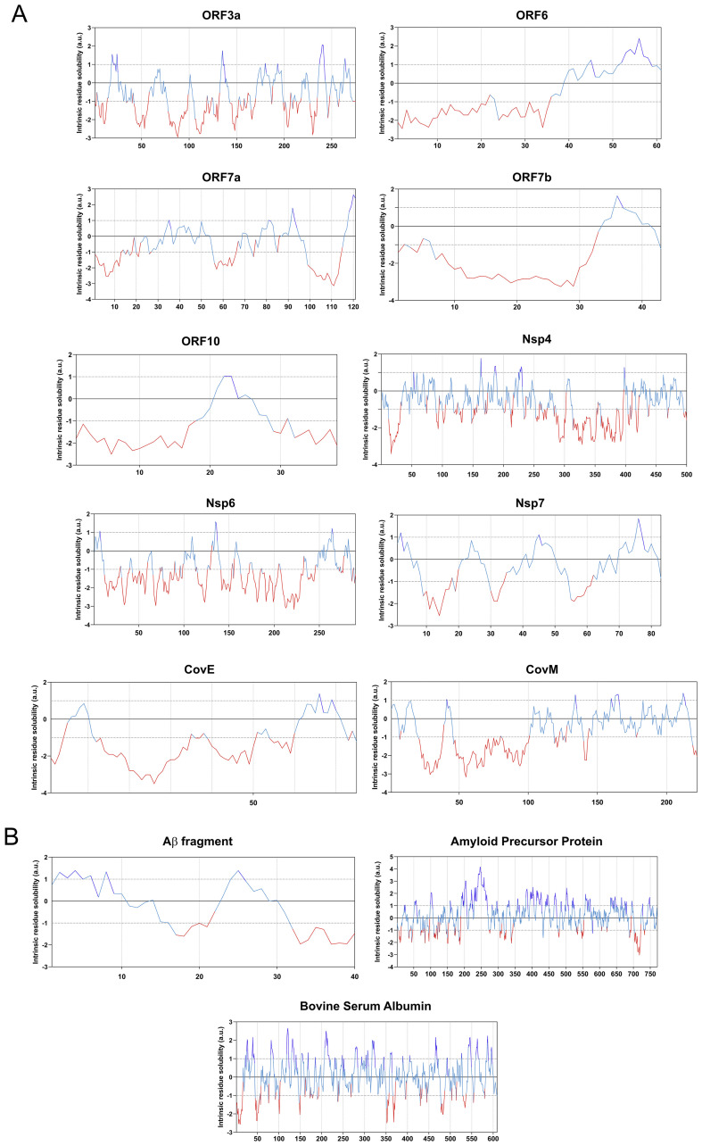
Fig. 3.
CamSol based analyses of protein solubility. Each graph displays the sequence based solubility profile for each query protein. The part of the curve corresponding to the most soluble protein fragments are shown in blue, and the regions of low solubility are shown in red for: a) SARS-CoV-2 aggregation prone protein solubility graphs; and b) positive and negative control proteins used in the study. (For interpretation of the references to colour in this figure legend, the reader is referred to the web version of this article.)

