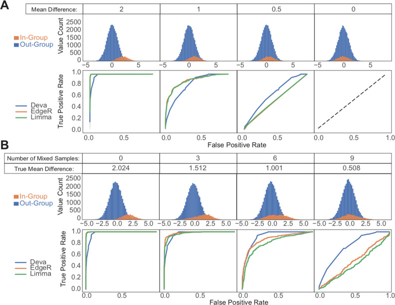
Figure 2.
Comparison of DEVA with EdgeR and Limma for simulated samples. The top panels show feature values for samples in each group. The bottom panels show ROC curves for each tested tool. (A) 88 out-group and 12 in-group samples were generated with 400 features each by sampling from Gaussian distributions with standard deviations of 1. Out-group means are 0; in-group means are as indicated. (B) For the simulated cohort with a mean difference of 2, increasing numbers of samples were swapped between the in- and out-groups to simulate imperfect labeling or heterogeneity.

