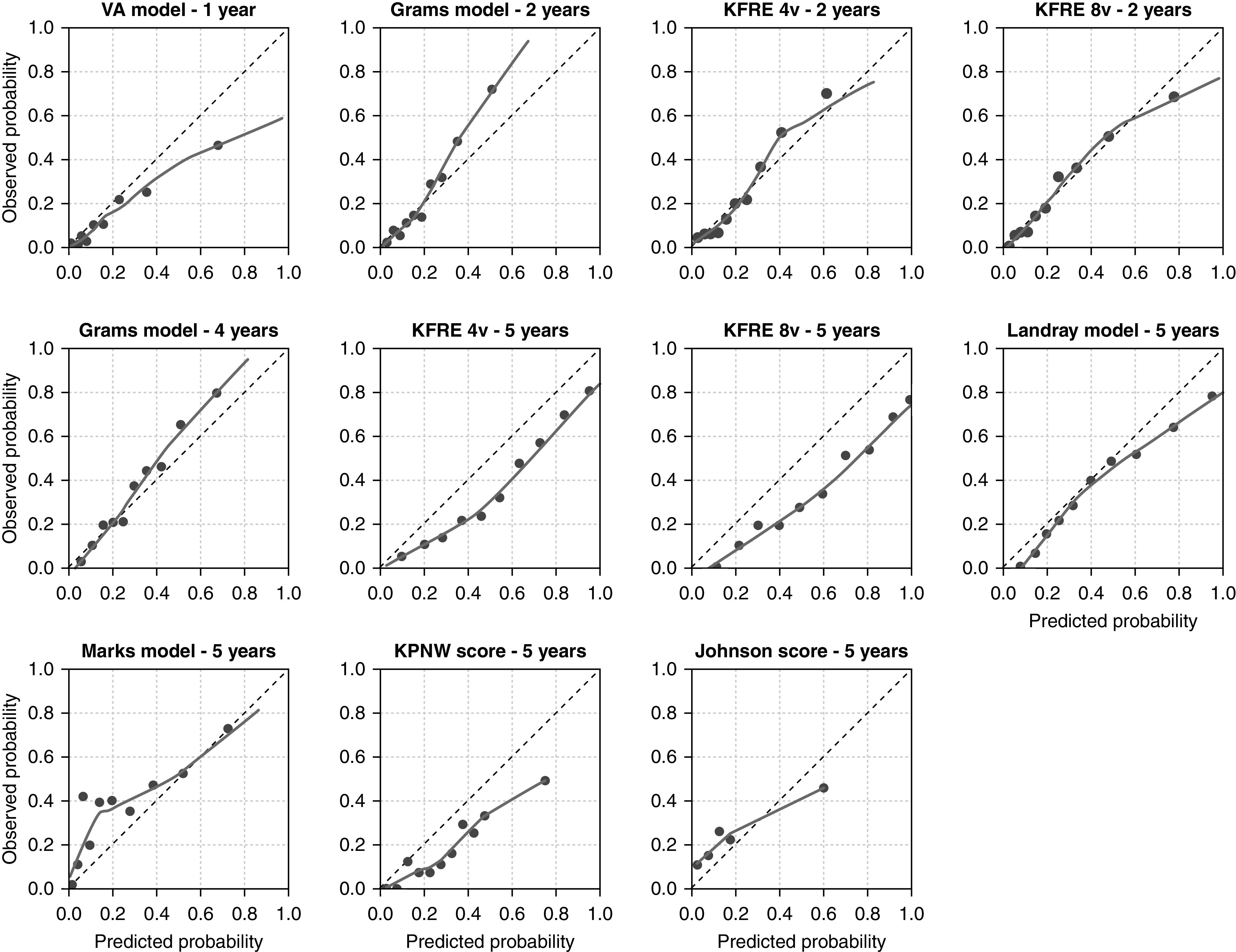
Figure 1.

Calibration plots for each validated model in EQUAL. The predicted probability is shown on the x axis, and the observed kidney failure rate is given on the y axis. The dotted 45° line represents perfect agreement between predicted and observed probabilities. The smoothed line is a lowess line through all predicted risks and corresponding observed risks. The dots represent a decile of the validation population (10%), ranked by predicted probability. For the KPNW score and the Johnson score, each dot represents a risk group category, which corresponds to the risk score categories. The observed probability was calculated with cumulative incidence functions. KPNW, Kaiser Permanente Northwest; VA, Veterans Affairs; 4v, four variable; 8v, eight variable.
