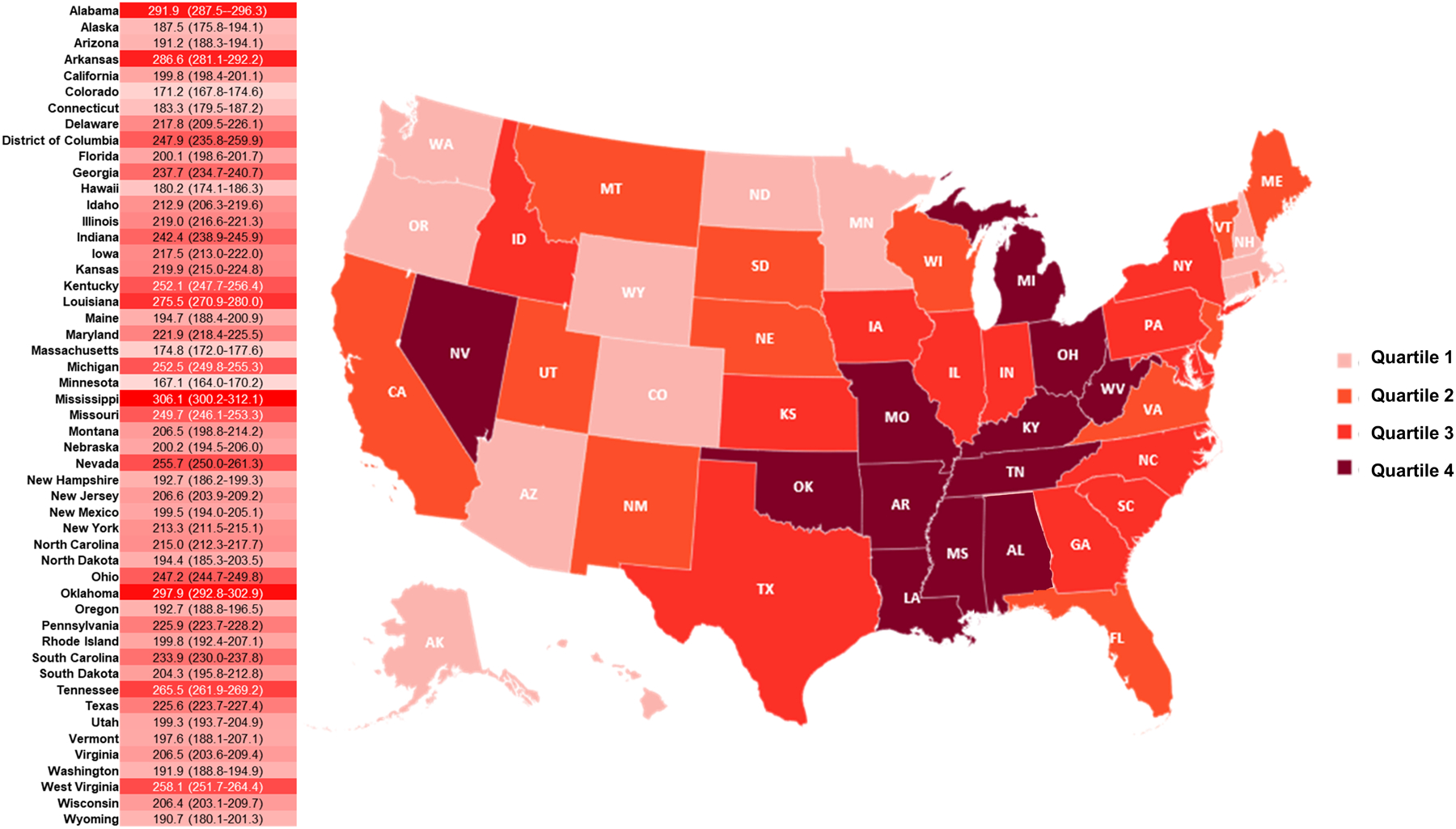
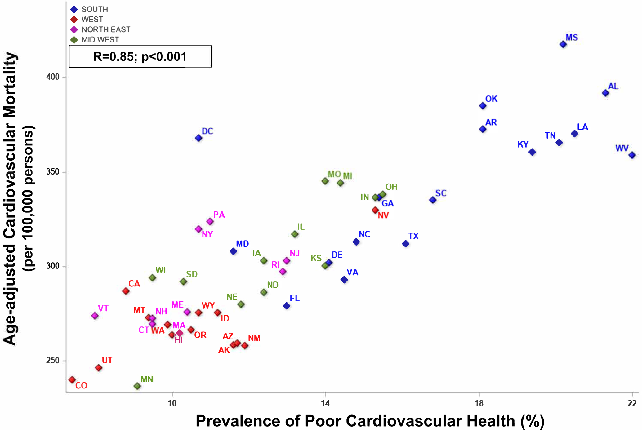
Figure 2. Geographic Distribution of Cardiovascular Mortality and Relationship with Prevalence of Poor Cardiovascular Health: 2017.


Panel A: Geographic Distribution of Cardiovascular Mortality. The heatmap depicts the age-adjusted cardiovascular mortality rate (per 100,000 persons). The darker shades indicate greater mortality, and lighter shade indicates lower mortality. The map shows the quartiles of cardiovascular mortality across the American states.
Panel B. Relationship of Cardiovascular Mortality and Prevalence of Poor Cardiovascular Health. The diamonds in blue indicate the states in the southern region. The red diamonds represent the states in the western region. The pink diamonds represent the states from the northeastern region. The green diamonds indicate the midwestern region states.
