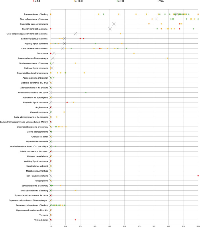
FIGURE 5.
Graphical representation of Napsin A data from this study (marked with a cross) in comparison with the previous literature (marked with a dot). In order to simplify the figure the percentage of weak, moderate and strong staining was merged. Yellow crosses are used for tumor entities with 10–50 evaluable cases and green crosses are used for tumor entities with >50 evaluable cases. Red dots are used for studies from previous studies involving 1–9 cases, yellow dots for studies involving 10–50 cases and green dots for studies involving >50 cases. All studies are quoted in the list of references.

