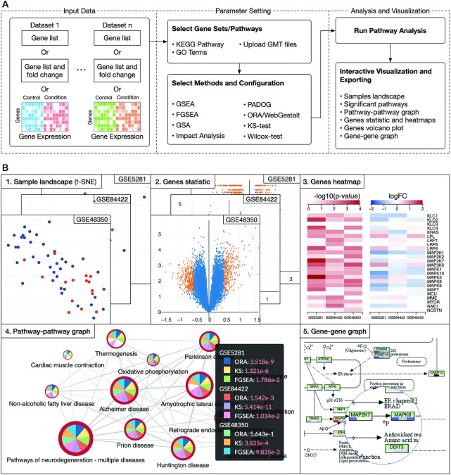
Figure 1.
The overall workflow and data visualization using consensus pathway analysis (CPA). (A) The analysis pipeline consists of three modules: i) input data, ii) parameter setting, and iii) analysis and visualization. The input in one dataset can be a gene list, a gene list and their fold changes (FC) or an expression matrix. In one analysis session, CPA allows users to analyze multiple datasets using multiple pathway analysis methods. (B) Result visualization. Once the analysis is done, users can interactively explore and export the results. For example, they can export the samples landscape (B1), volcano plot (B2), and heatmaps showing P-values and log FC across all datasets (B3). At the pathway level, users can interactively visualize the pathway–pathway connectivity graph (B4) and KEGG pathways (B5). Users can see detailed analysis results and statistics by clicking on each node of graphs (B4). In this example, the analysis includes three datasets and three methods. Analysis results, plots and graphs can be exported as comma-separated values (.csv file) or publication-ready figures (.png, .svg, etc.).

