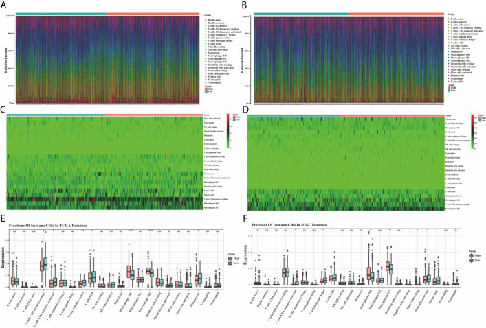
Figure 12.
The bar graphs for the distribution of 22 tumor-infiltrating immune cells between the high-risk and low-risk groups in the TCGA (A) and ICGC (B) datasets. The heatmaps for the correlation between risk groups and 22 immune cells in the TCGA (C) and ICGC (D) datasets. The boxplots for the comparison of the 22 immune cells between the high-risk and low-risk groups in the TCGA (E) and ICGC (F) datasets. *p < 0.05, **p < 0.01, ***p < 0.001. ns, no significance.

