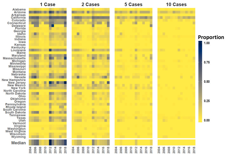
Figure 4.
State case counts. Vertical axis at left lists US State names (aligned as rows) and horizontal axis shows time (year). Color code indicates the proportion counties in each state estimated to experience 1, 2, 5, and 10 cases. Dedicated panels are provided from left to right for 1, 2, 5, and 10 cases, respectively. Darker tones indicate a relatively high proportion of counties in the state are subject to the given case count and lighter tones signify a lower proportion. Color coded bar parallel to horizontal axis gives the median proportion of US Counties subject to each case threshold.

