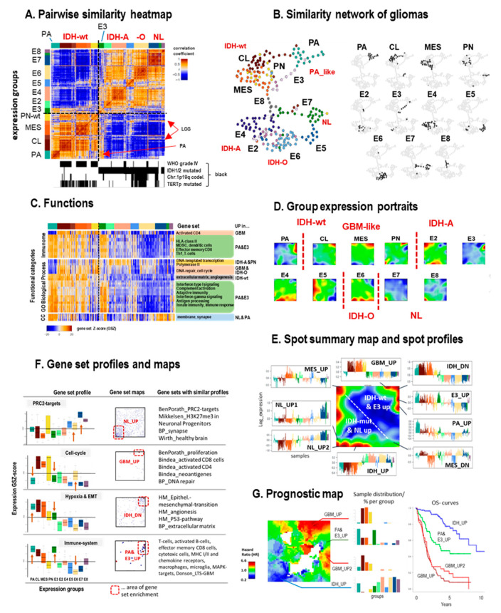
Figure 2.
Cartography of ‘all-glioma’ transcriptomes considering pilocytic astrocytomas (PA) and IDH-wt, IDH-A, IDH-O, and neuronal (NL) gliomas of WHO-grade II- IV (see text): (A) The pairwise similarity heatmap reveals two major clusters formed by IDH-wt and IDH-mut (and NL) gliomas, respectively. The IDH-mut subgroup E3 reveals similarities with PA and, to a lesser degree, also with CL and MES IDH-wt (GBM-like) gliomas. (B) The similarity net visualizes mutual similarities between glioma specimen (dots). It separates virtually all subgroups (PA, CL, MES, and PN for IDH-wt and E2–E8 for IDH-mut). In the right part, samples of each group are separately colored in black. (C) Heatmap of expression profiles of selected gene sets indicate up- and downregulation in a subtype-specific fashion (see Supplementary File 1: Figures S1–S4 for details). (D) The SOM maps of the different expression groups ‘portrait’ their expression patterns in terms of up- (in red) and downregulated (in blue) gene clusters. Note that each group is characterized by a unique ‘fingerprint’ expression portrait. (E) The overexpression summary map provides an overview about the spots upregulated in any of the groups, as illustrated by selected expression profiles. They indicate upregulation of the respective genes in a subtype-specific fashion. For example, ‘E3_UP’ assigns a spot that specifically upregulates in group E3 and partly in PA (see also the group portraits of E3 and PA in part D). (F) Box plots of the group-related expression of selected gene sets reveal characteristic effects. While PRC2 targets (and healthy brain functions) loose expression in gliomas compared with the NL subtype, cell cycle activity, immune response, and hypoxia (and EMT, epithelial mesenchymal transition) functionalities gain in expression, especially in IDH-wt gliomas. Interestingly, PA and E3 concertedly change in virtually all situations (see arrows). The gene set maps indicate accumulation of the genes of the respective set (shown by dots) in distinct areas of the map. Gene sets were taken from the literature [41,42,43,57]. (G) The prognostic map colors areas in which upregulation of the respective genes associates with high (red) or low (blue) hazard ratio (HR). The barplots show the composition of groups expressing the respective genes together with the respective overall survival curves (see Figure S7 for details).

