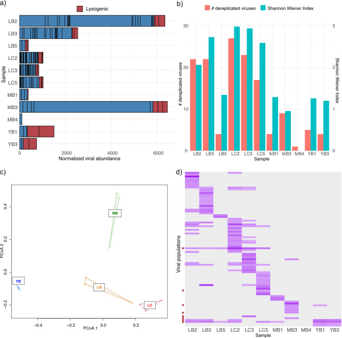
FIG 2.
Abundance and diversity analyses of viromes. (a) Abundance of viral contigs normalized by sequencing depth of each sample. Each bar denotes a single viral population, and predicted lysogenic viral populations are marked in red. (b) Alpha diversity and species evenness of viromes. (c) PCoA plot of viromes using a Bray-Curtis distance matrix. (d) Relative abundance profile of each viral population. Darker purple denotes a viral population with higher relative abundance in a sample (gray indicates none detected). Lysogenic populations are marked with red circles on the y axis. Graphs were visualized in R v4.0.2 (81) using ggplot2 (83).

