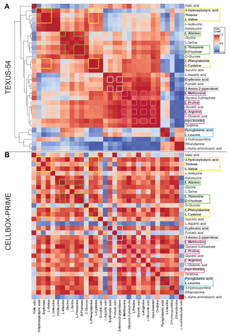
Figure 9.
Clustered correlation plot between metabolites for each experiment. Based on the per-sample abundance values, the Pearson correlation coefficients between each metabolite was calculated per experiment. Metabolites that correlate strongly with each other in both experiments are considered a cluster and highlighted with colored frames, one color per group. Clusters are an indicator for metabolic pathways; if elements of clusters are significantly altered, a profound altered gravity effect is indicated. (A) Clustered correlation plot for TEXUS-54. Metabolites are ordered by the clustering of their correlation coefficients, which is visualized on the left side of the plot. (B) Correlation coefficients for CELLBOX-PRIME. For maximum comparability, the metabolites are in the same order as for A, therefore a mixed pattern emerges that does not follow the clustering for metabolites in CELLBOX-PRIME. A large cluster is present in both experiments centered around Threose and L-Valine and around L-Phenylalanine and L-Cysteine.

