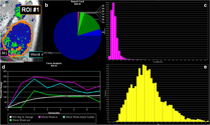
Fig. 3.
Visualization example of the volumetric analysis of a fibroadenoma B2 (benign finding in biopsy, no further procedure needed) in a 34-year-old woman. a The segmentation also shown in Fig. 1, (b) the distribution of enhancement curve types as defined in the methods section (red: wash-out; green: plateau enhancement; blue: persistent enhancement; the shades denote the initial enhancement: dark: slow, intermediate: medium, bright: fast). c A histogram of ktrans, e a histogram of ve values. The signal-intensity time curves for the whole lesion (white), the maximum initial enhancement (purple), the maximum wash-out (green), and the most suspect curve (turquoise) are shown in d. The figure presents some of the visualization methods provided by the software used for image data analysis. All raw data were exported voxel-wise for further analysis as specified in the methods section. The A.I. classifier provided a pseudo-probability of malignancy of 6% which was below both C1 and C2 thresholds

