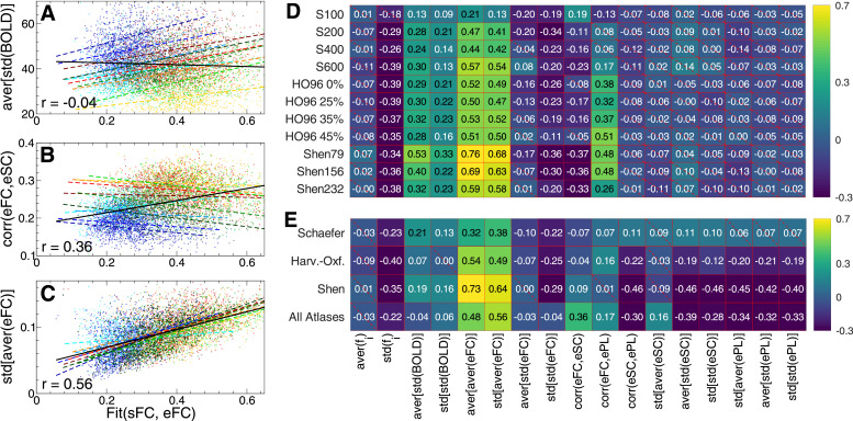
Fig. 7.
Relationship between the fitting results (3) of the phase model (1) and empirical data. (A-C) Scatter plots and the corresponding linear regression (straight lines) are shown for a few selected data variables from Fig. 6 indicated on the vertical axes versus the maximal similarity Fit(sFC, eFC) (horizontal axes). Each dot represents one subject/MRI session, and color corresponds to that used to differentiate between the parcellations in Fig. 6. The black solid lines depict the joint linear regressions for all data in the plots, and the joint correlations are also indicated. (D, E) Pearson correlation across individual subjects between the maximal similarity Fit(sFC, eFC) and several data variables indicated on the horizontal axis. The correlation was calculated for (D) different individual parcellations indicated on the vertical axis and (E) joint data merged over a few combinations of the considered parcellations as indicated on the vertical axis: all parcellations of the Schaefer atlas, Harvard-Oxford atlas, Shen atlas and all 11 considered parcellations (last row). The correlation is depicted by color, and its magnitude is indicated in the plot. The crossed out cells indicate that the corresponding correlation does not reach the statistical significance with .

