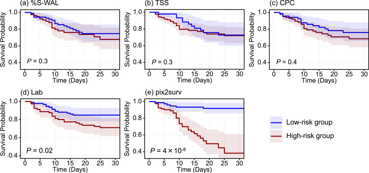
Fig. 5.
The Kaplan-Meier survival curves, stratified into low- and high-risk patient groups, of the common cases in the mortality analysis cohort included in Fig. 3. The estimated survival curves for the low-risk group (n = 85) and high-risk group (n = 86) are shown in blue and red, respectively, with shaded areas representing the 95% confidence intervals. The P values were obtained by application of the log-rank test to the two survival curves. (For interpretation of the references to color in this figure legend, the reader is referred to the web version of this article.)

