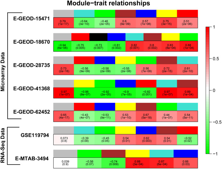
Figure 2.
Correlation of modules with pancreatic cancer (PaCa). Figure represents module colors for all datasets and correlation of modules with PaCa phenotype. Colors of modules are given in upper row, whereas green and red colors in lower row represent negative and positive correlation, respectively.

