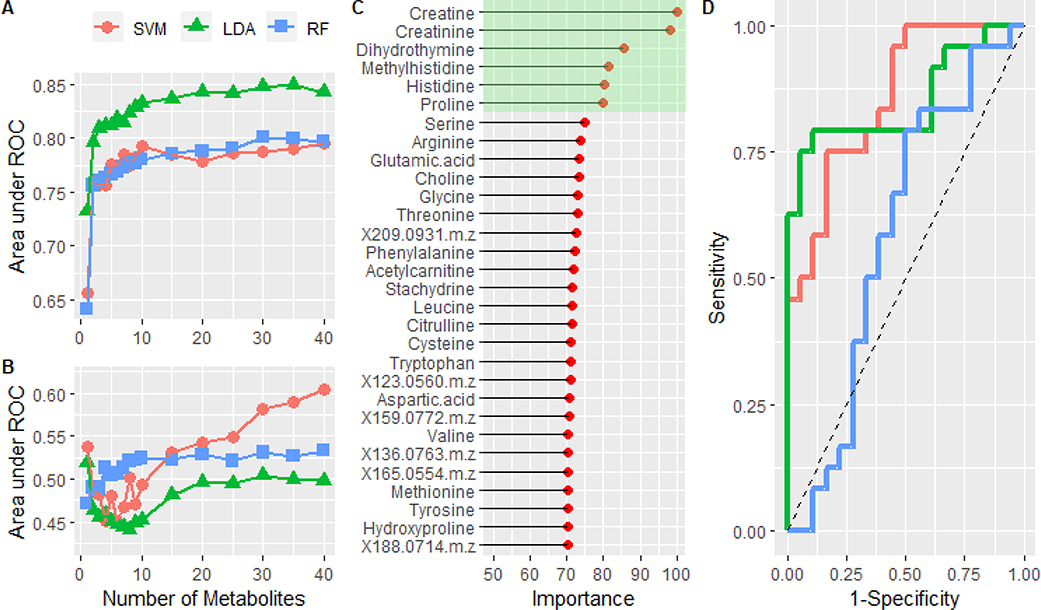
Figure 4:
A) The mean area under the curve is plotted as a function of the number of metabolites in the model. The performance of a support vector machine, linear discriminant analysis, and random forest models were compared. B) Training the same models on the data set in which the class labels were randomized. C) Normalized variable importance, based on area under the curve for individual metabolites, of the metabolites in the optimized LDA model. Green highlights the top 6 most important features. D) ROC analysis of the predicted classes from the test set using the full feature (n=35) LDA (red) and reduced feature (n=6) LDA model (green). The blue curve was created by using the LDA model constructed from the randomized data set. Dashed line represents the performance of a theoretical random classifier.

