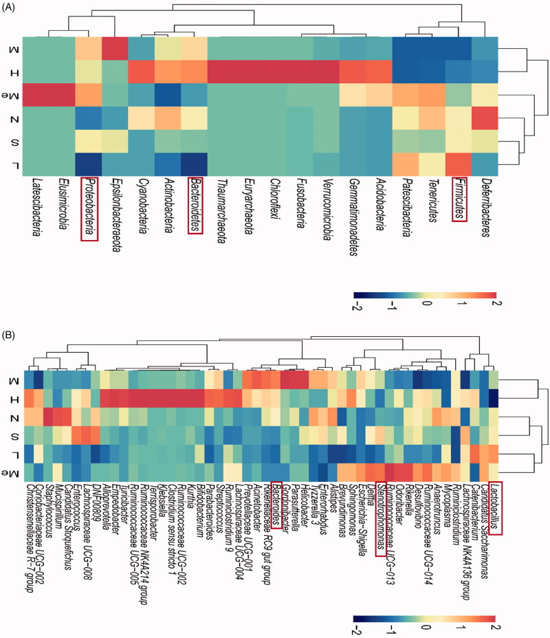
Figure 5.
Heatmap of the relative abundances of (A) top 50 phylum and (B) top 50 genera. The red rectangle represents the relative abundance of the changed phylum and genera. # p < 0.05 and ## p < 0.01 vs. the normal group. *p < 0.05 and **p < 0.01 vs. the model group. Data are reported as mean ± SD. N: normal; M: model; S: fluoxetine; L: TIV-L; Me: TIV-M; H: TIV-H (n = 3 per group).

