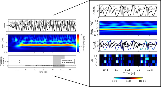
Figure 2.
HC epoch: Panel plot illustrating example performance of a typical HC subject (true negative) which can be visually interpreted using LRP decomposition and CWT frequency analysis. (HC, T25FW: 4.8 ± 0.35) The top row represents a 3-axis accelerometer trace captured from a smartphone over 15.4 seconds, which corresponds to 12 epochs of length 128 samples (or 2.56 [s]) with a 50% overlap. The magnitude ) of the 3-axis signal is highlighted in bold. The second row depicts the top view of the CWT scalogram of , which is the absolute value of the CWT as a function of time and frequency. The final row depicts the output disease classification probabilities (). The shaded grey area represents an example epoch (n=128 samples, or 2.56 [s]) within the acceleration trace, which is examined in the larger subplot through the decomposition of DCNN input relevance values () using Layer-Wise Relevance Propagation (LRP). Red and hot colours identify input segments denoting positive relevance () indicating (i.e. MS). Blue and cold hues are negative relevance values () indicating (i.e. HC), while black represents () inputs which have little or no influence to the DCNNs decision. LRP values are overlaid upon the accelerometer signal, where the bottom panel represents the LRP activations per input (i.e. ).

