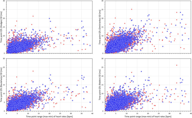
Figure 7.
Scatter diagrams between heart rate ranges (max–min) and standard deviations of QTc values of individual study time-points. The left top, top right, bottom left, and bottom right panels show the relationship for Hodges, Dmitrienko, Rautaharju, and Rabkin corrected QTc intervals, respectively. In all panels, all time-points of all study subjects are pooled together, red and blue marks show the data of female and male subjects, respectively. Outliers beyond the ranges of the axes were also present in the data. The abbreviations and meaning of panels are the same as in Fig. 6. The note in the caption of Fig. 6 also applies—compare the panels with panels of Fig. 6.

