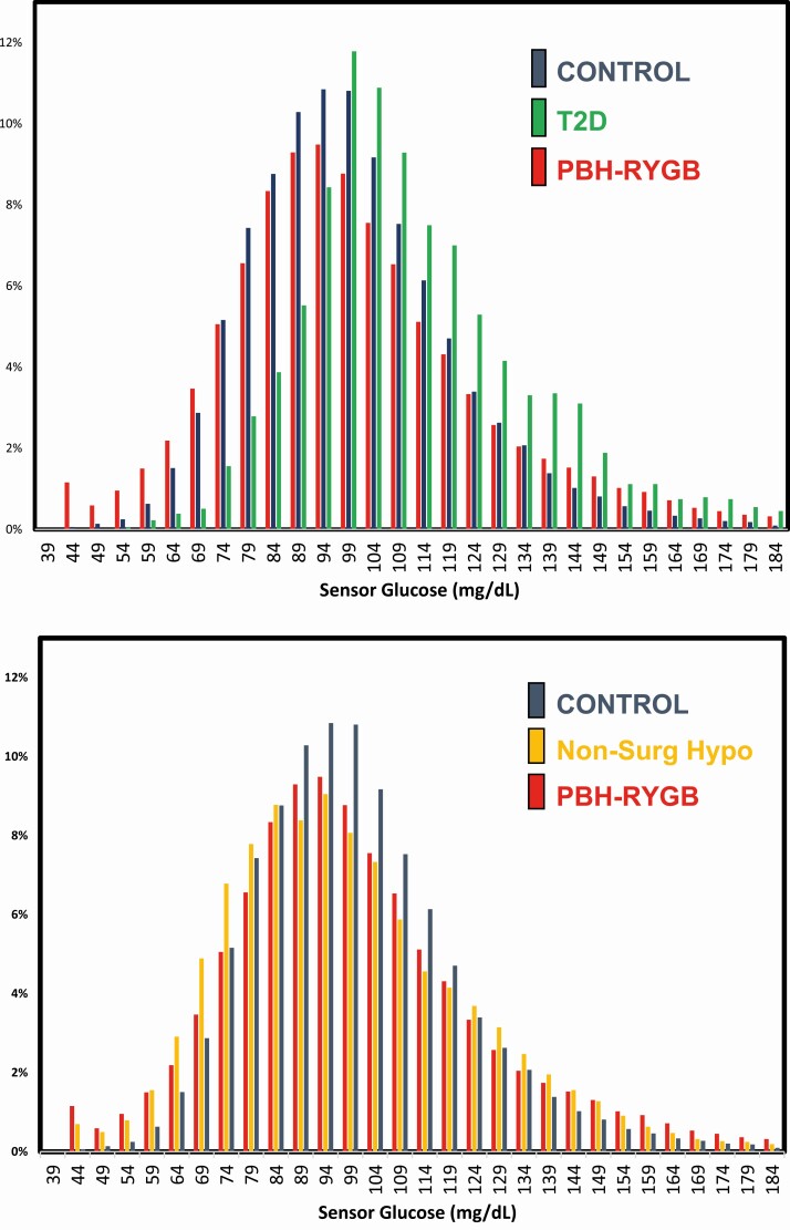
Figure 1.
Distribution of sensor glucose values. The histograms demonstrate the % of glucose values within each sensor glucose range (5 mg/dL intervals). A, Data for controls indicated in blue bars, T2D in green, and PBH-RYGB in red. B, Data for controls (blue), Non-Surg Hypo (yellow), and PBH-RYGB (red).

