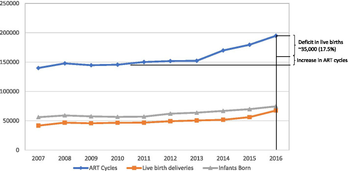
Fig. 3.
A comparison of total ART cycle starts with live births and infants born 2007–2016 This figure demonstrates the discrepancy between live births and ART cycle starts over the study period. As is very obvious cycle starts ran, more-less, in parallel between 2007–2010; but starting with 2011 increasingly diverged. By 2016, the deficit in live births reached ~ 35,000 (17.5% of cycle starts). The figure also shows a mild convergence between live births deliveries and infants born, again demonstrating a relative decline in multiple births. On a national level this decline, however, further exacerbates the number of “lost” live births for the country. This figure does not take into consideration that cumulatively frozen-thawed cycles may have compensated for some lost pregnancy and live births in fresh cycles, as in detail discussed in the text.
Modified from www.cdc.gov/art/artdata/

