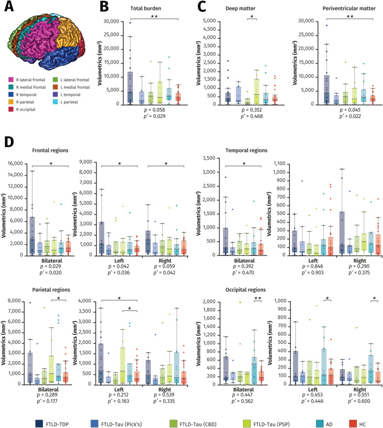
Fig. 2.
Comparison of white matter hyperintensity volumes between groups. Box plots show white matter hyperintensity volumes on T2-weighted images according to neuropathological diagnosis, with lower and upper hinges of each boxplot corresponding to 25th and 75th percentiles of data. A SABRE parcellation of brain regions. B Total intracranial white matter hyperintensity burden. C Deep white matter and periventricular white matter hyperintensity burden. D Regional white matter hyperintensity volumetrics. Underneath the graphs are P values for differences between subgroups (ANOVA) and P’ values for differences between subgroups adjusting for age and vascular risk factors (ANCOVA). All bars in the figure are significant differences between each pair with * = P < 0.05 and ** = P < 0.005, corrected for age at imaging and vascular risk factors. Abbreviations: AD Alzheimer’s disease, CBD corticobasal degeneration, FTLD frontotemporal lobar degeneration, HC healthy controls, PSP progressive supranuclear palsy

