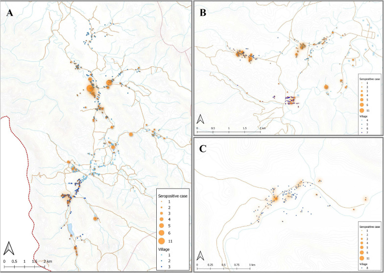
FIGURE 5.
Spatial distribution of model predicted recent P. vivax exposure status. The location of individuals (at the household level) who were classed as seropositive (orange dot) in the algorithm, using the antibody responses against the top eight P. vivax proteins. The size of orange dots represents the seropositive cases ranging from 1 to 11. The shading in orange represents multiple sero-positive individuals in the same household or multiple positive households in the one area. Blue dots are indicative of seronegative in the algorithm. The map was made using QGIS 3.16 software. Bongti (A) had 354 seropositive individuals out of a total 2,334 individuals tested (sero-prevalence of 15.2%). Suan Phueng (B) was the second largest region with seropositive prevalence of 259 in the 1,514 individuals (17.1%). Kong Mong Tha (C) was the smallest region and also had the lowest sero-prevalence, with 51 of the 407 individuals having a serological signature of recent P. vivax exposure (12.5% sero-prevalence).

