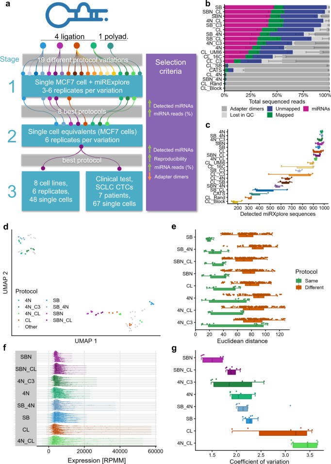
Fig. 1. Experimental setup and protocol comparison with miRXplore spike-in (stage 1).
a Overview of the experimental setup consisting of three stages. SCLC CTCs = small cell lung cancer circulating tumor cells. b Read distribution for all tested protocols, sorted by miRNA reads proportion. The data are presented as mean values ± the standard deviation (n = 6 biologically independent samples for the top eight protocols, n = 3 for the others), which is shown as a smaller error bar in a darker color than its corresponding read group and only represented in one direction. c Detected miRXplore sequences for all tested protocols, sorted by decreasing average per protocol shown as boxplot (bottom) and dot plot (top). Each sample is shown as one dot and colored by protocol. The boxes span the first to the third quartile with the vertical line inside the box representing the median value. The whiskers show the minimum and maximum values or values up to 1.5 times the interquartile range below or above the first or third quartile if outliers are present. d UMAP embedding of all sequenced samples with miRXplore spike-in. The samples of the best eight protocols are highlighted in their respective color. The remaining protocols are grayed out. e Euclidean distance on the log2 transformed sequence expression showing the reproducibility between all replicates of the same protocol (green) and between all samples of one protocol variant compared to all other protocol variants (brown). Each dot represents the distance observed between two samples. Only nonredundant distances are shown (i.e., the distance of sample 1 to sample 2 is considered identical to the distance of sample 2 to sample 1). For each protocol, a dot plot (top), as well as a boxplot (bottom), is shown. The boxplot was defined in the same manner as for panel c. f Distribution of the top 100 highest expressed miRXplore sequences per sample, normalized as reads per million mapped (RPMM). The samples are grouped by protocol and ordered by ascending coefficient of variation. The vertical lines inside the areas delimit the quartiles. Every dot inside the area represents the expression level of one sequence. g Coefficient of variation for all samples grouped by the protocol in ascending order shown as dot plot (top) as well as boxplot (bottom). Each sample is represented by a dot. The boxplot was defined in the same manner as for panel c. Source data are provided in the Source Data file.

