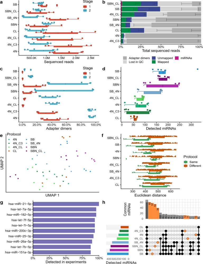
Fig. 2. Protocol comparison with single cell equivalents (stage 2).
a Number of reads sequenced in stage 1 (miRXplore spike-in) and 2 (MCF7 single cell equivalents), shown as boxplot (bottom) and dot plot (top). Each dot represents one sample. The boxes span the first to the third quartile with the vertical line inside the box representing the median value. The whiskers show the minimum and maximum values or values up to 1.5 times the interquartile range below or above the first or third quartile if outliers are present. b Read distribution for all tested protocols, sorted by miRNA reads proportion. The data were presented as mean values ± the standard deviation (n = 6 biologically independent samples), which is shown as a smaller error bar in a darker color than its corresponding read group and only represented in one direction. c Adapter dimers found in stage 1 and stage 2, shown as boxplot (bottom) and dot plot (top). Each dot represents one sample. The boxplot was defined in the same manner as for panel a. d Detected miRNAs for every sample, sorted by decreasing average per protocol shown as boxplot (bottom) and dot plot (top). Each sample is shown as one dot and colored by protocol. The boxplot was defined in the same manner as for panel a. e UMAP embedding of all samples. Each sample (dot) is colored by its protocol. f Euclidean distance on the log2 transformed sequence expression showing the reproducibility between all replicates of the same protocol (green) and between all samples of different protocols (brown). Each dot represents the distance observed between two samples. Only nonredundant distances are shown (i.e., the distance of sample 1 to sample 2 is considered identical to the distance of sample 2 to sample 1). For each protocol a dot plot (top), as well as a boxplot (bottom), is shown. The boxplot was defined in the same manner as for panel a. g Top ten miRNAs detected in multiple experiments. h Upset plot showing the miRNAs jointly detected by multiple protocols, or exclusively found in only one protocol (orange). The bar plot at the top shows on the y-axis the number of miRNAs detected by the protocols highlighted by connected black or orange dots in the grid below. The bar plot on the left shows on the x-axis the total number of miRNAs detected in the least one of the replicates of the protocol shown on the y-axis. Source data are provided in the Source Data file.

