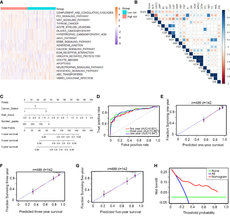
Figure 3.
Biological functions and clinical applications of the 12 TFs. (A, B) Pathway profiles in the light of TCGA dataset. Rows referred to pathways, and columns stood for patients. Each grid stood for a score of pathway activity calculated by single-sample GSEA. The ssGSEA score was further rescaled by min-max normalization method. The upper horizontal bar marked the information involved in every case which contained risk cluster and risk score (from low to high). In order to fit the picture size, the pathway labels in (B) were handled as abbreviations of the corresponding pathway names in (A) . (C) The nomogram was performed in the entire TCGA database, with cancer status as well as number packs. (D) 1-, 3-, 5-year ROC curves for the TFs-based nomogram. (E–G) Represented the 1-, 3-, 5-year nomogram calibration curves, respectively. The closer the dotted line fit to the perfect line, the better the predictive performance of the nomogram was. (H) The decision curve analysis (DCA) for the nomogram. The net benefit was plotted versus the threshold probability. The red line was the nomogram. The blue line was the treat-all and the green was the treat-none.

