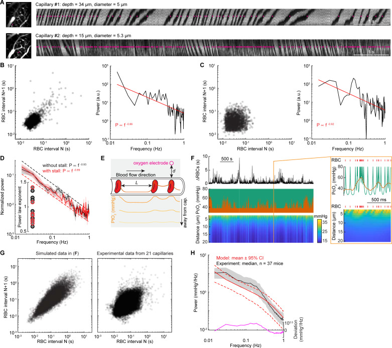
Fig 6. RBCs spacing heterogeneity contributes to 1/f-like oxygen fluctuations.
(A) Representative line scan images showing the RBCs spacing in 2 different capillaries with (top) and without (bottom) stall events in an example mouse during rest. The images on the left showing the vasculature around the measurement sites, as indicated by the magenta line. Scale bar = 50 μm. The magenta dots indicate the detected RBCs. (B) Left, Poincare plot showing the relationship between consecutive RBC spacing intervals (i.e., autocorrelation trend) of capillary #1. The dark area indicates the density of the RBC spacing. Right, power spectrum for the RBC spacing of capillary #1. The Poincare plot showing 3,341 RBCs in a 142.8-second resting period. (C) As (B) but for capillary #2. The Poincare plot showing 2,603 RBCs in a 100.4-second resting period. (D) Group average of power spectrum of inter-RBC transit time for data without stall events (black, n = 13 capillaries) and with stall events (red, n = 8 capillaries). Inset, fitted power law exponent for each of the capillaries with (red circle) and without (black circle) stall events. (E) Schematic showing that PO2 measured at the RBC border decreases with distance and reaches its lowest value between 2 RBCs. Orange line inside the capillary denotes the oxygenation carried by the RBC and the plasma. The gray shaded area denotes brain tissue. Solid traces inside the gray shaded area denote PtO2 at different distance away from the capillary wall (as indicated by the arrow). (F) Simulated data example showing the fluctuations of RBC spacing (top), oxygenation in the capillary (middle, green), and oxygen in the tissue (bottom) generated by simulating a Krogh cylinder of 20 μm radius supplied by a capillary of 3 μm radius. The orange trace (middle) denotes the simulated tissue oxygenation fluctuations close to the capillary wall, counting in the low-pass filtering nature of the oxygen diffusion dynamics and the response properties of the polarographic electrode. The orange box denotes a 1-second segment of the dataset. The red tick marks denote the passage of a single RBC. (G) Poincare plot showing the relationship between consecutive RBC spacing intervals for the simulated data example (left) shown in (F) and all experimental data from 21 capillaries (right). (H) Comparison of power spectrum of tissue oxygenation measured using polarographic electrodes (black) and generated using the simple model (red). The black trace denotes the median of all power spectrum from experiments. The edge of the gray shaded area indicates the 75 percentiles and 25 percentiles of the experimental data. The red line denotes the mean (solid line) and the 95% CI (dashed line) from the model. The magenta line denotes the deviation between the experimental and simulated data. The data used to generate this figure are available at https://doi.org/10.5061/dryad.pg4f4qrmt. CI, confidence interval; RBC, red blood cell.

