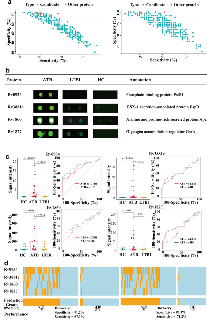
Figure 4.
Biomarker discovery. (a,b) Scatter plots of the sensitivity and specificity of all proteins on the microarray. Each dot represents one protein. Left panel: proteins present at different levels in the ATB-vs-LTBI (left panel) and ATB-vs-HC (right panel) comparisons. Red dots: proteins with (1) a discriminant ability (sensitivity + specificity − 100) > 10%; (2) a fold change > 2 and a p-value < 0.05; and (3) at least 90% specificity. (b) Microarray results and annotations of the 4 proteins selected as candidate biomarkers. (c) Box plots and ROC curves for each of the 4 candidate biomarkers. Left panels: box plots show that the signal intensities of the each candidate biomarker is significantly higher in the ATB group than in the HC and LTBI control groups. Right panel: ROC curves. The sensitivity and specificity values obtained at the optimal cut off value for each candidate biomarker are also shown. (d) Performance of the top biomarker panel, comprised of Rv0934, Rv3881c, Rv1860, and Rv1827. Orange and light blue lines represent samples scored as positive or negative, respectively. A sample was predicted as ATB positive when any of the four proteins in the panel was positive. The heatmap was drawn using the ‘pheatmap’ package (v1.0.12)23.

