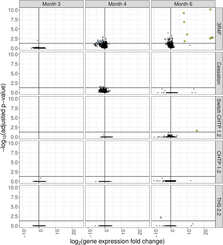
FIGURE 4.
Differential gene expression analysis of cecum tissue from mice in the various exposure groups, displayed as a “volcano plot.” Each data point corresponds to a gene, with the x-axis value being the log2 fold change in the exposure group relative to the sham group, and the y-axis being the negative log10 of the adjusted p value associated with the fold change. Points with adjusted p values <= 0.05 and an absolute expression fold change greater than 2 are rendered as large circles and are colored by whether they have an expression fold change less than –2 (light blue) or greater than 2 (yellow).

