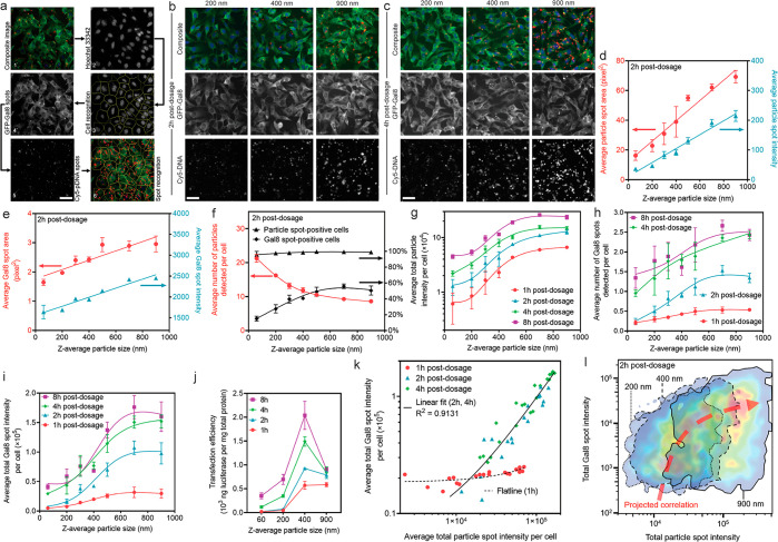
Figure 4.
Quantitative Cellomics high-content analysis (HCA) of cellular uptake and endosomal escape by particles with different sizes. (a) The image analysis modality to analyze fixed cells directly in the tissue culture plates. Representative images are shown in (b) at 2 h and (c) at 4 h after incubation with particles of different sizes. Quantitative results are presented in terms of (d) particle spot characteristics (area and intensity), directly suggesting successful size control during particle–cell interactions. (e) Gal8 spot characteristics (area and intensity) indicating the formation of larger endosomal vesicles by larger particles. (f) Frequency of detected particles and Gal8 spots in cells at 2 h. (g) Average total particle intensity per cell at all time points as a representative measure of total particle uptake quantity. (h) Average number of Gal8 spots per cell at all time points as an indication of endosomal escape level, serving as a predictive index for transfection efficiency according to previous reports using this assay. (i) Quantitative measure of overall endosomal escape degree, i.e., average total Gal8 spot intensity per cell, due to different Gal8 spot characteristics observed for different particle sizes. (j) Transfection efficiencies (luciferase reporter expression level) as a result of incubation with particles at different sizes for different periods of time, which correlated well with the trends of total cellular uptake and endosomal escape levels. (k) Regardless of the particle size, fitting the overall endosomal escape level (Y axis) of all plate well-averaged data points against the overall cellular uptake level (X axis) shows a strong positive correlation at 2–4 h postdosage. In the figure, n = 21 wells for the fitted line of 1 h and n = 42 wells for the fitted line of 2 and 4 h. (l) Fitting the endosomal escape level in a single cell (Y axis) of all cells assessed in the same well of the group of 200 nm (n = 5400 cells), 400 nm (n = 4693 cells), and 900 nm (n = 4336 cells), against the cellular uptake level in the same single cell (X axis), shows a strong positive correlation. The figure was generated by overlapping the FlowJo-generated pseudocolor heat maps showing the cell distribution density with an arbitrary correlation curve plotted. In (a–c), all figures share the same scale bar of 50 μm.

