. 2021 Jul 16;10:e69068. doi: 10.7554/eLife.69068

Figure 2. Baseline metric comparison.

(A) Steps involved in computing response magnitudes for units in the ephys dataset. (B) Same as A, but for the imaging dataset. (C) Drifting gratings spike rasters for an example ephys neuron. Each raster represents 2 s of spikes in response to 15 presentations of a drifting grating at one orientation and temporal frequency. Inset: spike raster for the neuron’s preferred condition, with each trial’s response magnitude shown on the right, and compared to the 95th percentile of the spontaneous distribution. Responsiveness (purple), preference (red), and selectivity (brown) metrics are indicated. (D) Same as C, but for an example imaged neuron. (E) Fraction of neurons deemed responsive to each of four stimulus types, using the same responsiveness metric for both ephys (gray) and imaging (green). Numbers above each pair of bars represent the Jensen–Shannon distance between the full distribution of response reliabilities for each stimulus/area combination. (F) Distribution of preferred temporal frequencies for all neurons in five different areas. The value D represents the Jensen–Shannon distance between the ephys and imaging distributions. (G) Distributions of lifetime sparseness in response to a drifting grating stimulus for all neurons in five different areas. The value D represents the Jensen–Shannon distance between the ephys and imaging distributions.

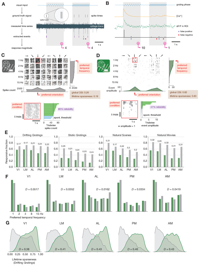
Figure 2.

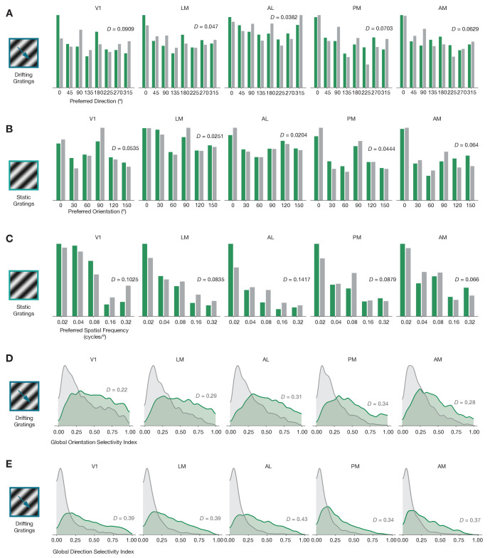
Figure 2—figure supplement 1. Baseline comparisons for additional preference and selectivity metrics.

Figure 2—figure supplement 1.

(A) Distribution of preferred directions across five areas. (B) Distribution of preferred orientations across five areas. (C) Distribution of preferred spatial frequency across five areas. (D) Distribution of global orientation selectivity index across five areas. (E) Distribution of global direction selectivity index across five areas. In all plots, ephys = gray and imaging = green.
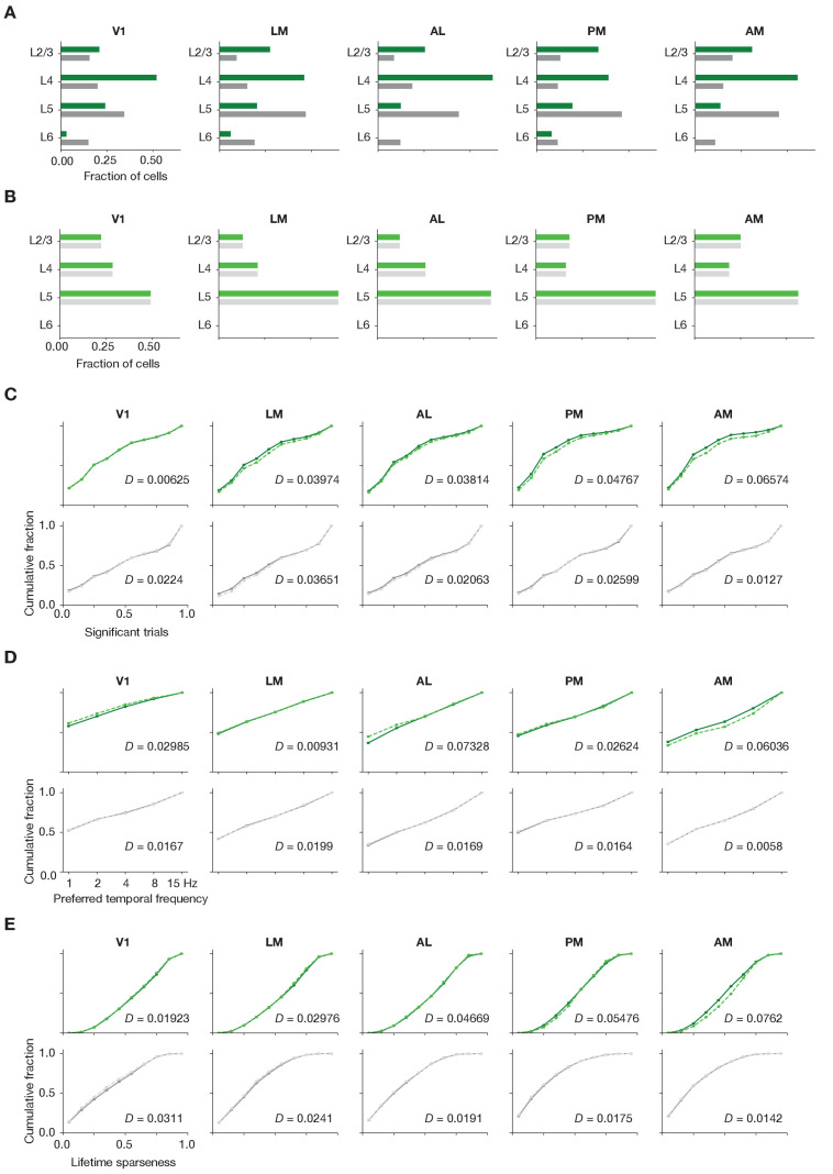
Figure 2—figure supplement 2. Matching laminar distribution patterns across modalities.

Figure 2—figure supplement 2.

(A) Original layer distributions, prior to resampling, for imaging (green) and ephys (gray). (B) Layer distributions following the resampling procedure, for imaging (light green) and ephys (light gray). (C) Cumulative histograms of significant trial fractions for imaging and ephys, before and after resampling. (D) Cumulative histograms of preferred temporal frequency for imaging and ephys, before and after resampling. (E) Cumulative histograms of preferred temporal frequency for imaging and ephys, before and after resampling. The value D represents the Jensen–Shannon distance between the before/after distributions. In panels (C–E), lighter dashed lines represent the values after resampling.
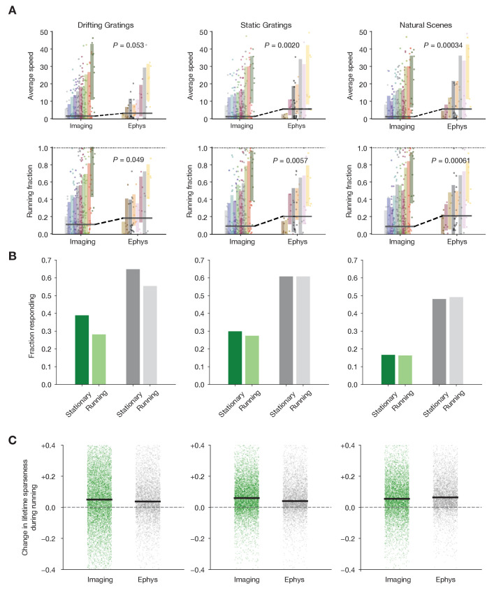
Figure 2—figure supplement 3. Characterizing the impact of running behavior on response metrics.

Figure 2—figure supplement 3.

(A) Average speed and running fraction for individual mice from imaging and ephys experiments, grouped by genotype. Shaded areas represent the mean ± standard deviation for each genotype. Colors are the same as in Figure 1F. p Values are from the Mann–Whiteny U test between all imaging and all ephys values for each stimulus/metric combination. (B) Fraction of neurons responding to three stimulus types during stationary and running intervals. Neurons were included only if the mouse was stationary or running on at least 20% of trials. (C) Change in lifetime sparseness during running intervals for all neurons from imaging and ephys experiments. Black line represents the median change for each modality/stimulus type.
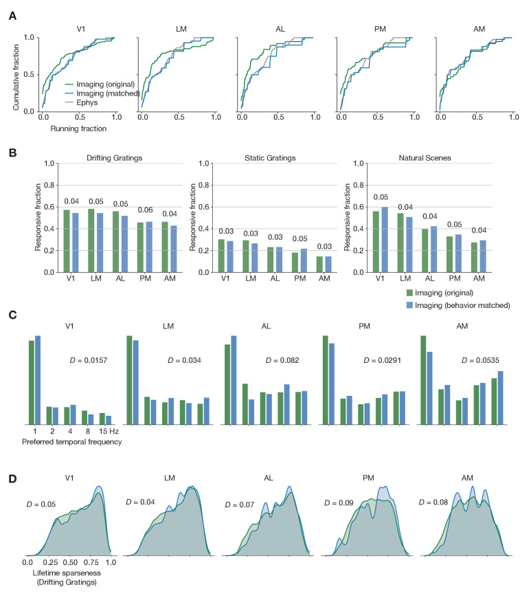
Figure 2—figure supplement 4. Matching running behavior across modalities.

Figure 2—figure supplement 4.

(A) Cumulative histogram of drifting gratings running fractions for the ephys dataset, and for the imaging dataset before and after performing the behavioral matching procedure. (B) Fraction of neurons deemed responsive to each of three stimulus types, before and after sub-sampling the imaging experiments to match ephys running behavior. Numbers above each pair of bars represent the Jensen–Shannon distance between the full distribution of responsive trial fractions for each stimulus/area combination. (C) Distribution of preferred temporal frequencies for all neurons in five different areas. The Jensen–Shannon distance between the original imaging and resampled imaging distributions is shown for each plot. (D) Distributions of lifetime sparseness in response to a drifting grating stimulus for all neurons in five different areas. The Jensen–Shannon distance between the original imaging and resampled imaging distributions is shown for each plot.