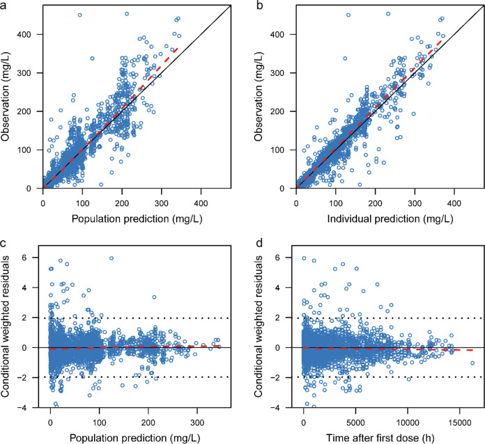
Fig. 2. Goodness-of-fit plots of the final population pharmacokinetic model.
The upper left plot represents the observations versus the population predictions (a). The upper right plot represents the observations versus the individual predictions (b). The lower left plot represents the conditional weighted residuals versus the population predictions (c). The lower right plot represents the conditional weighted residuals versus the time after dosing (d). The red line represents the locally weighted scatterplot smoothing line

