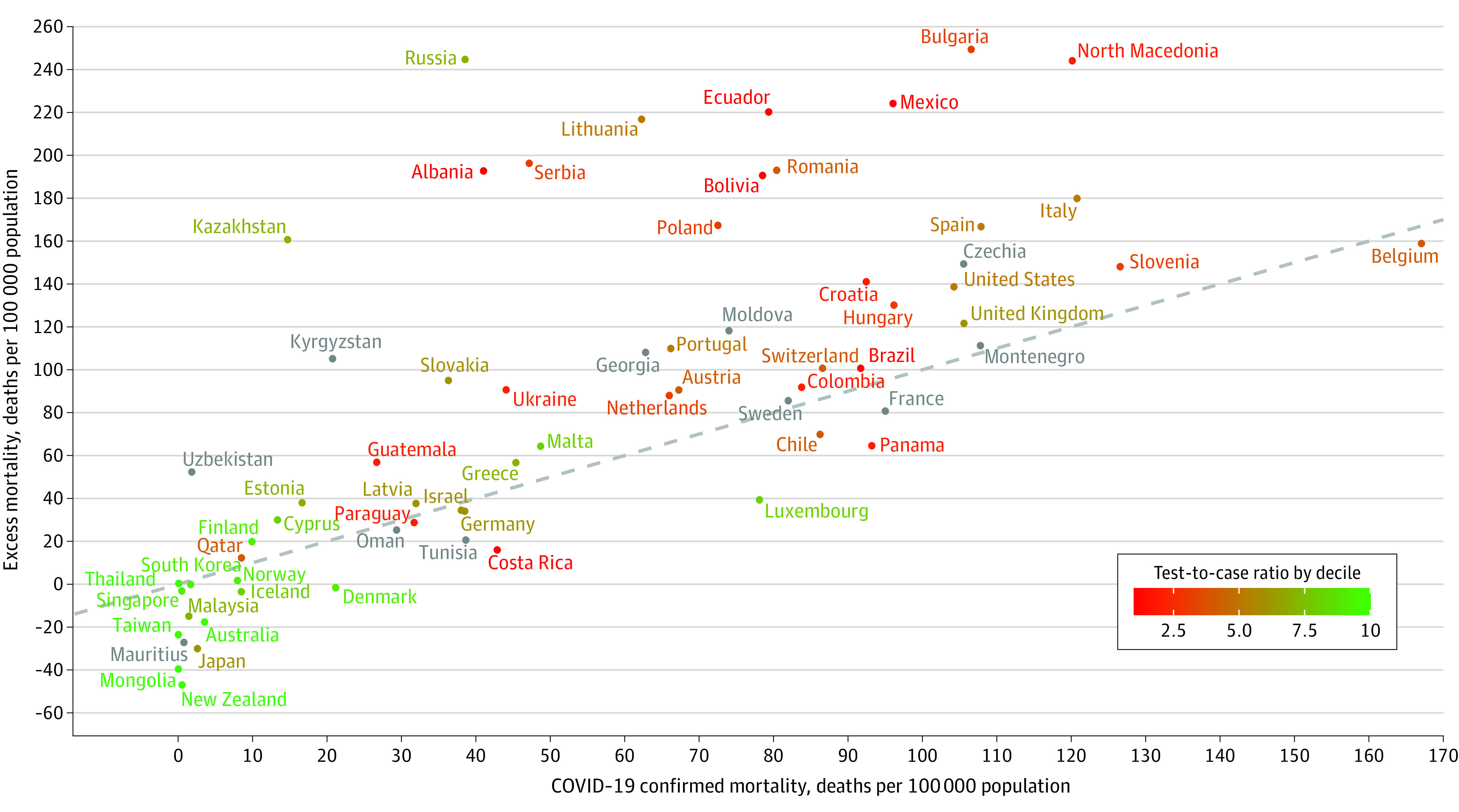
Figure. Scatterplot of COVID-19 Confirmed Mortality vs Excess Mortality in 67 Countries, February 26 to December 31, 2020.

The dashed diagonal line represents the equality between the number of excess deaths and of COVID-19 reported deaths. The 0 marker on the y-axis indicates no excess mortality. Countries are colored according to their decile of the test-to-case ratio. Countries appearing in gray had unavailable or incomplete data on testing.
