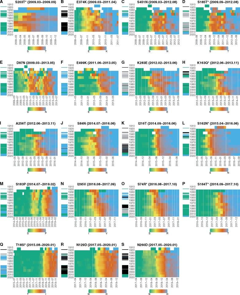
Figure 5.
Timing of amino acid substitutions in different birth-year groups. Panels A–S in the figure correspond to amino acid substitutions shown in Table 1 in the same order. In each panel, X-axis represents the first month of a four-month sliding window, and Y-axis represents the birth-year of patients. The population of patients were grouped into ten-year birth-year groups. Each cell in a heatmap is color-coded according to the frequency of viruses having the fixed new amino acid in the population of a birth-year group at Y-axis in a four-month sliding window starting at the month on the X-axis. A cell is green if the frequency of new amino acid in the birth-year group is zero, and it is blue if the frequency in the birth-year group is one, as shown in the color key in the legend. Cells with no data are represented in white. The horizontal bars on the left of each heatmap represent the dominant amino acid at the corresponding position on HA of viruses circulating in the year on the Y-axis. The color of a bar on the left of each heatmap represents the dominant amino acid at the same position on HA of viruses circulating in the year when patients were born. A green bar indicates the circulation of viruses having the old amino acid at the substituted position on HA in the year when patients were born, and a blue bar indicates the circulation of viruses having the new amino acid at the same position. A bar with grey or black color indicates the circulation of viruses having a dominant amino acid different from both the old and new amino acids at the substituted position in the year when the patients were born. Amino acid substitutions with an asterisk represent substitutions which occurred at an epitope position.

