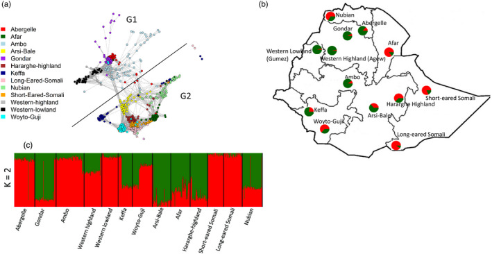
Figure 4.

(a) NetView P plot for K‐NN = 75 showing clustering of the 13 populations into two groups. (b) Geographic sampling regions in Ethiopia together with pie charts showing ancestry proportions for K = 2 generated in ADMIXTURE. (c) ADMIXTURE bar plot showing proportion of ancestries for K = 2
