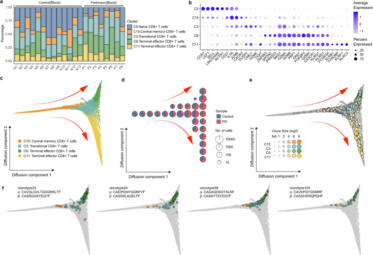
Fig. 3. Relationship among CD8+ T cell clusters based on both transcriptome and TCR data.
a Percentage of CD8+ T cells in each sample shows reduction of naïve CD8+ T cells (C5 cluster) and expansion of terminal effector CD8+ T cells (C6 cluster) in the blood of PD patients. b Dot plot shows the expression of the Top 5 highly expressed genes in each cluster. The size of the dot corresponds to the percentage of cells expressing the gene in each cluster, and the color represents the average log normalized gene expression. c Pseudotime ordering of CD8+ T cells in a diffusion trajectory using the first two diffusion components. Each dot represents a cell colored by different cell cluster. The main trajectories were indicated with arrows. d Cell sample composition in the diffusion trajectories. The diffusion trajectory in c was divided into 10 × 10 square grids according to the horizontal and vertical coordinates, and each pie chart reflects the sample composition of cells in each grid area. e Clonotypes distributed in the diffusion trajectories. Each dot represents a unique clonotype in each cluster. The size of the dot reflects the clone size in each cluster. Clonotypes with clone size >1 were colored by cluster. Nonclonal clonotypes are colored in gray. The coordinates of each clonotype were calculated by the average coordinates of the cells in the clonotype. f Examples of clonally expanded CD8+ T cells in different cell types. Cells from 4 clonotypes (clonotype23, clonotype24, clonotype38 and clonotype103) were highlighted in the diffusion trajectories. Each dot represents a cell colored based on its cluster.

