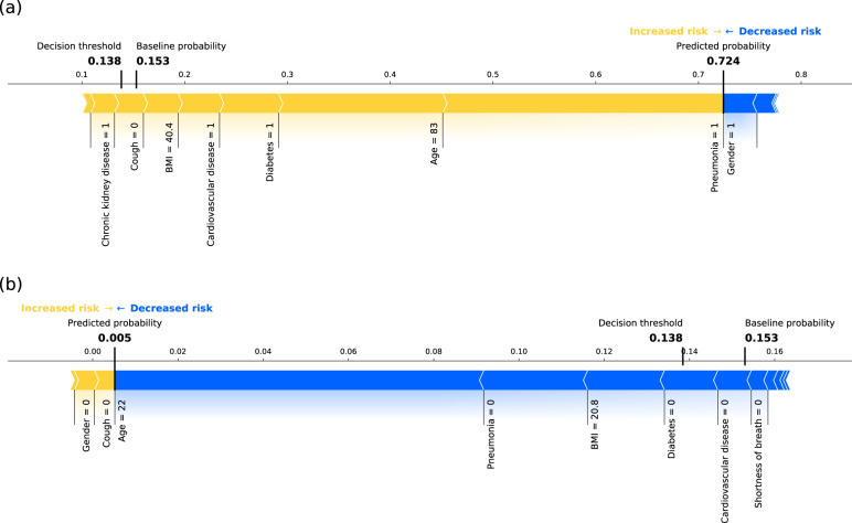
Fig. 8. Example predictions using the final model.
Composition of predictions (SHAP values computed in probability space) for a one example patient going into critical state and b one patient not entering critical state, based on the final model. The yellow arrows represent the contributions of major risk factors (e.g., older age, pneumonia, or comorbidities), and the blue arrows represent the contribution of factors decreasing the probability of entering critical state (e.g., female gender = 1). Note that this graphical representation only allows due to spatial constraints to display the names of the major contributing factors for this specific example (i.e., a subset of all features used by final model). The baseline probability and the decision threshold are relatively low but close to the actual ratio of patients entering critical state in our cohort, illustrating the class imbalance.

