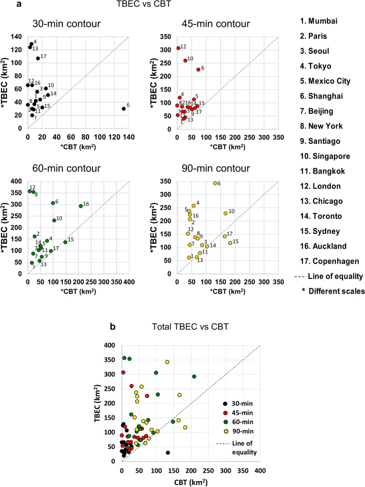
Figure 3.
Comparison of fastest travel mode between PT and PCs for 17 cities (Supplementary Tables 2, 3 and 4). (a) Data points of the 17 cities for four contour maps, where, in referring to Fig. 2, TBEC (Transit Beats or is Equal to Cars) is the sum of the blue and green areas (in km2), CBT (Cars Beat Transit) is the pink area (in km2), with city number marked as a data point. The four figures are proportional to the line of equality with different scales used for TBEC and CBT. (b) All data points of the four contour-map scenarios for (a) using the same colors as for the (a) data points.

