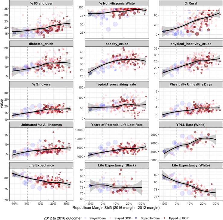
Fig 3. Scatterplots for all counties in the 4 states that flipped from Democrat to Republican in 2016 (Michigan, Pennsylvania, Wisconsin, Maine), showing the Republican margin shift on the x axis, and different demographic and public health related variables on the y axis.
Counties are sized by the total number of votes made in the 2016 election, and they are colored by the 2012 and 2016 outcomes. The top row includes variables frequently discussed in the narrative around the electoral shift in these states, including the percentage of Non-Hispanic Whites in the county. There is a clear relationship between the obesity rate, physical inactivity rate, smoking rate, and life expectancy and the Republican margin shift in these states.

