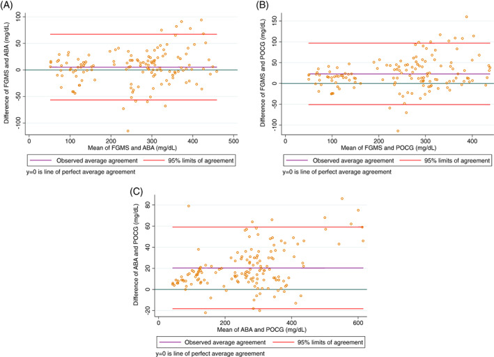
FIGURE 1.

Bland‐Altman plot of the difference between the gold standard automated biochemistry analyzer serum glucose concentration and interstitial glucose concentration measured by the flash glucose monitoring system (A), between the blood glucose concentration measured by the point‐of‐care glucometer and interstitial glucose concentration measured by the flash glucose monitoring system (B), and between the gold standard automated biochemistry analyzer serum glucose concentration and the blood glucose concentration measured by the point‐of‐care glucometer (C) in all samples. For each plot, the green line represents a mean difference of 0 between the compared glucose concentrations, the purple line represents the actual mean difference between the compared glucose concentrations, and the red lines represent the 95% limits of agreement (mean difference ± 1.96 SD). The closer the purple line is to the green line, the better the agreement between the 2 compared glucose concentrations
