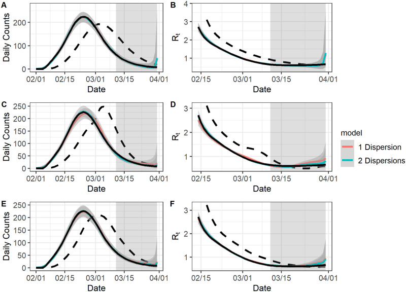
Fig 2. The model fit for complete data.
For all graphs: the black solid curve corresponds to estimates based on the known epidemic curves and the black dashed curve corresponds to estimates based on the reported curves. The grey-shaded region superimposed on the curve depicts the 95% Bayesian credible interval and the grey-shade region on the right indicates the region of nowcasting. The colored curves represent different model choices. All values were averaged over 1000 simulated datasets with the correct l. A: The epidemic curve estimates if the reporting delay distribution was unchanged. B: The reproduction number estimates if the reporting delay distribution was unchanged. C: The epidemic curve estimates if the reporting delay distribution was sharply improved. D: The reproduction number estimates if the reporting delay distribution was sharply improved. E: The epidemic curve estimates if the reporting delay distribution was gradually improved. F: The reproduction number estimates if the reporting delay distribution was gradually improved.

