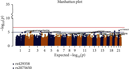
Figure 2.

Manhattan plot of genome-wide association study (GWAS) between AD and HC groups. The y-axis shows the p value (on the –log10 scale) for each association test. The x-axis is the chromosomal position of each SNP. The horizontal lines in the Manhattan plot display the cutoffs for two significant levels: blue line for p < 10−5 (generally significant level) and red line for p < 1.66e−7.
