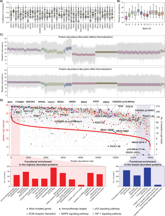
FIGURE 2.

The Melanoma Protein Abundance Map. LC‐MS/MS data was first normalized across batches of analysis in the MM500 study. (A) Violin plots showing the distribution of intrabatch coefficients of variation for the 45 proteins, identified in 100% of the samples and with less than 60% of variation in all batches. (B) Box plots of the relative abundance of the 45 less variable proteins in each batch. The median abundance in each batch was used for inter‐batch abundance correction of the melanoma proteome. (C) Box plots of protein relative abundance across all samples of the the study, before (top panel) and after (bottom panel) intra‐ and interbatch abundance normalization using the 45 proteins with the lowest variability. (D) Distribution of the malignant melanoma proteome ranked according to protein abundance across all samples (left y‐axis) and the number of samples where the protein was identified (right y‐axis). Proteins were represented by the gene names. The lines point to WT protein products of genes with driver mutations in melanoma. Proteins involved in pathways commonly dysregulated in melanoma, proteins with known driver mutations, and proteins linked to melanoma therapy are marked in different colors as indicated. The number in parentheses specifies the designated isoform of the protein. A typical example is the protein Transforming acidic coiled‐coil‐containing protein 1, where the canonical protein TACC1, the isoform 2 TACC1(2), and isoform 4 TACC1(4) were quantified. A more complex example is represented by the gene CDKN2A that codes for the canonical proteins p16‐INK4a and p14ARF being both quantified, together with the isoform 4 of the former (CDKN2A (4) p16‐INK4a) and the mutated protein p16‐INK4a P114L. At the edges of the plot are highlighted enriched pathways for high‐ (red) and low‐ (blue) abundance proteins
